BACKGROUND
Dr Dimitri Amiras, Musculoskeletal Consultant Radiologist at Imperial NHS Healthcare Trust, approached me to help with the UX of a tool he is designing for students to practice CT guided interventions.
CT guided interventions are done with the patient laying in the CT scanner, with the Doctor using the live scans to plan and adjust the trajectory of their needle.
Currently, students have to practice this technique on patients. Dr Amiras is developing an app using a 3D printed spine and artificial flesh, and an AR projection on top of this to allow students to recreate the feeling of the intervention and improve their skills without having to have a patient involved.
I was brought in to develop the app for use on mobile platforms and was the end to end designer of it.
RESEARCH
Goals:
-
Find out how the users currently use the app
-
Understand the user flow of the app from the user’s pov
-
Understand what barriers the users currently encounter with the app
-
Understand how using the app independent of instruction may make it more difficult for the user.
Method:
User Interviews
I interviewed 6 people with experience of using the app.
Reflection - I spent a lot of time before the interviews getting myself accustomed to the medical jargon used in this particular field. I looked into CT guided interventions and what kind of products other companies had on the market and how they worked.
This really helped as I approached the interviews as I had a much more rounded idea of what terms meant and how systems worked.
Results:
The first takeaway from the research was that the majority of users thought it was a good idea and would be extremely useful when finished. The said it was a low stakes way of practicing CT guided interventions and did teach you how to ‘drive’ the equipment.
The number one user frustration by far was the labelling of the app. This created huge problems for the users and was the main barrier to successfully working with it.
The labelling issue fell into a number of areas:
-
Where is the patient's head and where is the feet?
-
Which way are the head and the feet on the 3D printed phantom?
-
Which way is left and right both on the scans and the patient?
-
Which number slice of the CT scans are we looking and which way would be towards the head and towards the feet?
-
How thick are the slices of the CT scan being used?
-
Also the current labelling on the screen is dark on a dark background so can’t be read
The other issues the users presented were that the phantom’s flesh was too thin (the needle moved in it, whereas it wouldn’t in a patient), and that calibration and accuracy of the needle reading needed to be improved. I will pass both of these onto the developers as areas for them to focus on with the external parts of the app moving forward.
Link to the full Affinity Map.
DEFINE
Findings after Research:
-
Users want clear labelling of the patient's head and feet on scans, AR and phantom
-
Users want clear labelling of left and right on scans, AR and phantom
-
Users want clear information on the screen of slice size and slice number
-
Users thought the app was a good idea, but needed it to more accurately reflect a real CT guided intervention
DESIGN
Sitemapping, User Flow and Task Flow:
I kept the sitemap simple and split the app into 3 basic sections:
Planning: Allow the students to look at all scans and select their starting slice
Calibration: Calibrate the needle and phantom with the AR
Intervention: Undertake the practice intervention.
With the user and task flows I concentrated on tasks that would test if the labelling was now better and if students could navigate around the app as they would during a real CT guided intervention.

Wireframing
I first designed mid fidelity wireframes.
I then took time to design a colour scheme, logo, name and look for the site. I decided on a pale green and blue complimentary scheme as this was calming. Using this I then built the UI kit.
Testing
I did 3 rounds of usability testing with Maze, the first round moderated, the next two unmoderated.
Results
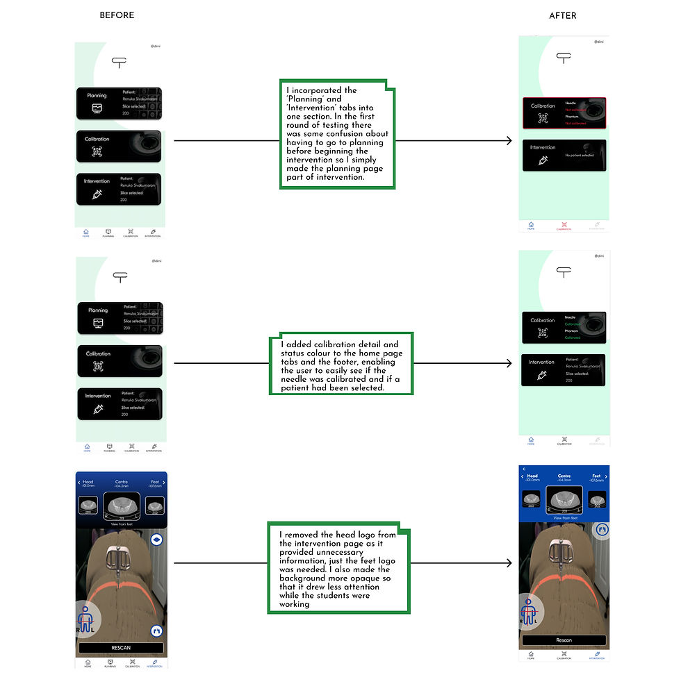
I iterated changes based upon the testing
CONCLUSION
I was delighted to help on what I feel is a useful app for student doctors. The time I spent in clarifying the labelling of all of the various areas paid off when getting the testing results.
This project was challenging for me as it was within an area I previously knew very little about so it was good to immerse myself in the project and come up with viable solutions for Dr Amiras and his students.
Next Steps
If I was continuing to work upon this app I would like to test more upon how the planning page before the intervention worked, and if the students had enough information on that page to move forward with. I would like to work and test more closely with the team who make the physical phantom as I feel the interaction between 3D printed patient and the AR overlay is essential for user experience.
I divided the users into two user personas

In the final round of testing the sign in/create account flow had 100% accuracy with an SEQ score of 7.
Both of the slide flows (by number and direction) had 100% accuracy and an SEQ of 7.
The change slide and rescan flow had an 100% accuracy and an SEQ rating of 6.6.
And finally the needle calibration flow had an accuracy of 100% and an SEQ of 6.6
Final Wireframes
The full final wireframes can be found here.
Designing an app to train radiologists in CT guided interventions


